Building a great website isn’t just about technology or design; it’s also about understanding human psychology. This Steve Krug Book offers valuable principles and guidelines on the basics of user experience. This isn’t just a book for developers and designers, but also anyone who wants to understand how people behave and how you can make things more usable. In this free Don’t Make Me Think book summary, we’ll outline some of the key principles behind web/mobile usability and user experience (UX) design.
In essence, this summary will cover:
- What is the Main Idea of Don’t Make Me Think, Revisited?
- What are the 3 Laws of Usability?
- How does Don’t Make Me Think Improve UX design?
- Other Usability Considerations
- Getting the Most from Don’t Make Me Think, Revisited
- Don’t Make Me Think, Revisited Chapters
- About The Author of Don’t Make Me Think, Revisited
- Don’t Make Me Think, Revisited Quotes
- Frequently Asked Questions
Let’s dive straight into it!
What is the Main Idea of Don’t Make Me Think, Revisited?
The Don’t Make Me Think, Revisited book equips you and your team with useful principles and tips to prevent and address usability issues on your own. The original version, first published in 2000 around the dot-com crash, was updated in this 2013 edition with newer examples and to showcase additional changes in the digital landscape.
Although technology has evolved rapidly, the principles in the book remain unchanged because usability is fundamentally about human psychology, which is slow to change. Once you understand how the human brain works, you can continue to apply these insights to improve user satisfaction even as technology and landscapes evolve.
We elaborate on these changes in our full Don’t Make Me Think summary.
Note: “Website” in this article refers generically to both websites and web/mobile apps.
What are the 3 Laws of Usability?
Steve Krug presents us with 3 Laws:
- First Law: The Design should be Self-evident
- Second Law: The Navigation should be Obvious and Intuitive
- Third Law: The Content should be Concise
Basically, something is usable if an average person can figure out how to use it to achieve an outcome without it being more trouble than it’s worth. Here’s a visual representation of the three laws:

Law #1: Don’t Make Me Think
The goal is to take note of the user’s valuable time and make your website effortless to use, i.e. make it self-explanatory, if not self-evident. This is the overarching rule. Each time a user has to pause (even for a split-second) to think about something, it’s a waste of time and eventually distracts the user from the action you want them to take.
A website is self-evident when users “get” what it’s about and how to use it without having to think. As a rule of thumb,
(i) Make clickable links/buttons obvious and
(ii) Use words that are obvious to everyone.
Avoid technical jargon, clever-but-confusing marketing phrases, or terms that’re specific to your industry/company.
Law #2: Make Every Click an Obvious Choice with No Need to Think
Krug believes that the number of clicks doesn’t matter, so long as each click is mindless (i.e. no thinking required) and obvious (i.e. the user is sure it’s the right choice). You should make straightforward navigation on your website The only exception for accessibility issues is during slow internet speed, in which case the # clicks will make a difference.
Law #3: Half the Words on Each Page, then Half Them Again
Remove all unnecessary words to reduce distractions, allow the key content to stand out, and shorten the page to minimize scrolling. The only exception is for news or content-driven articles.
In our full book summary, we elaborate on these 3 laws with more details and examples.
How does Don’t Make Me Think Improve UX design?
How People Use the Web
People do not read websites in a sequential, detailed or orderly fashion. Specifically:
- We scan (not read) web pages;
- We make reasonable (not optimal) choices; and
- We go for guesswork (not the “right” approach).
In our complete 16-page summary, we elaborate on these ideas and break down what it means in terms of web design, navigation and home page design.
Design Your Website for Easy Scanning
How do you design your site for quick and easy scanning? In our full summary, we elaborate on why/how to:
(i) Use existing conventions,
(ii) Use effective visual hierarchies,
(iii) Format your content for easy scanning,
(iv) Make every click mindless and obvious, and
(v) Remove distractions or “noise” on your website.
Web Navigation
Navigating a website is like looking for something in a huge departmental store, except it’s harder to tell:
(i) How much of the website is unexplored,
(ii) Where you are on the site, and
(iii) How to return to a specific place in a website.
One thing is certain: people will leave if they can’t find what they’re looking for.
Consistent navigation must help users to:
(i) Find what they’re looking for, and
(ii) Know where they are on the site plus what options are available to them there.
In our complete Don’t Make Me Think summary, we share more on
(i) How to think about web navigation, and
(ii) How to use various components to improve ease of navigation (e.g. global vs local navigation, site ID, sections & subsections, utilities, search bars, page name, “You are here” indicators), and
(iii) How to test the effectiveness of your site navigation.
Home Page
The Home page is one of the most challenging pages to design because you must fit in so many things, including your site ID and mission, site hierarchy, search functions, teasers/highlights (of key content, features, and deals), shortcuts to commonly-used content/features, digital products and registration or login forms.
Fundamentally, your Home page must give a clear, big-picture overview of your site, since the initial impression will affect how the user interprets (or misinterprets) everything else on your site, and people tend to return to your Home page as a “base” to orientate themselves.
In our complete book summary, we elaborate on the 4 key questions to address and how to guide the user on where to start.
How to do Usability Testing
Usability tests are about watching how people use something (e.g. your website). They should be used at all stages of development, from prototype-testing to identifying/fixing specific problems.
You can hire usability consultants from $5-10k, but it’s also possible to do DIY testing using the tips in this book. For a deeper look into how modern behavioral data can inform interface testing and improve human-computer interaction design, check out Cornell’s research article from 2021, assessing Website Design Quality via Usability Testing.
In the full Don’t Make Me Think summary, we explain how you can do testing in just 1 morning each month, to identify actionable insights to improve your site. Here’s a quick overview:

Other Usability Considerations
Generally, usability principles and testing are generally similar for web and mobile, though you must be even more rigorous in mobile content break-down and make things even more self-evident.
In our complete 16-page summary, we also outline the key considerations for
(i) Mobile usability,
(ii) Maintaining goodwill,
(iii) Solutions for usability issues and
(iv) Gaining management support for web usability improvements
(v) Mobile application design.
Getting the Most from Don’t Make Me Think, Revisited
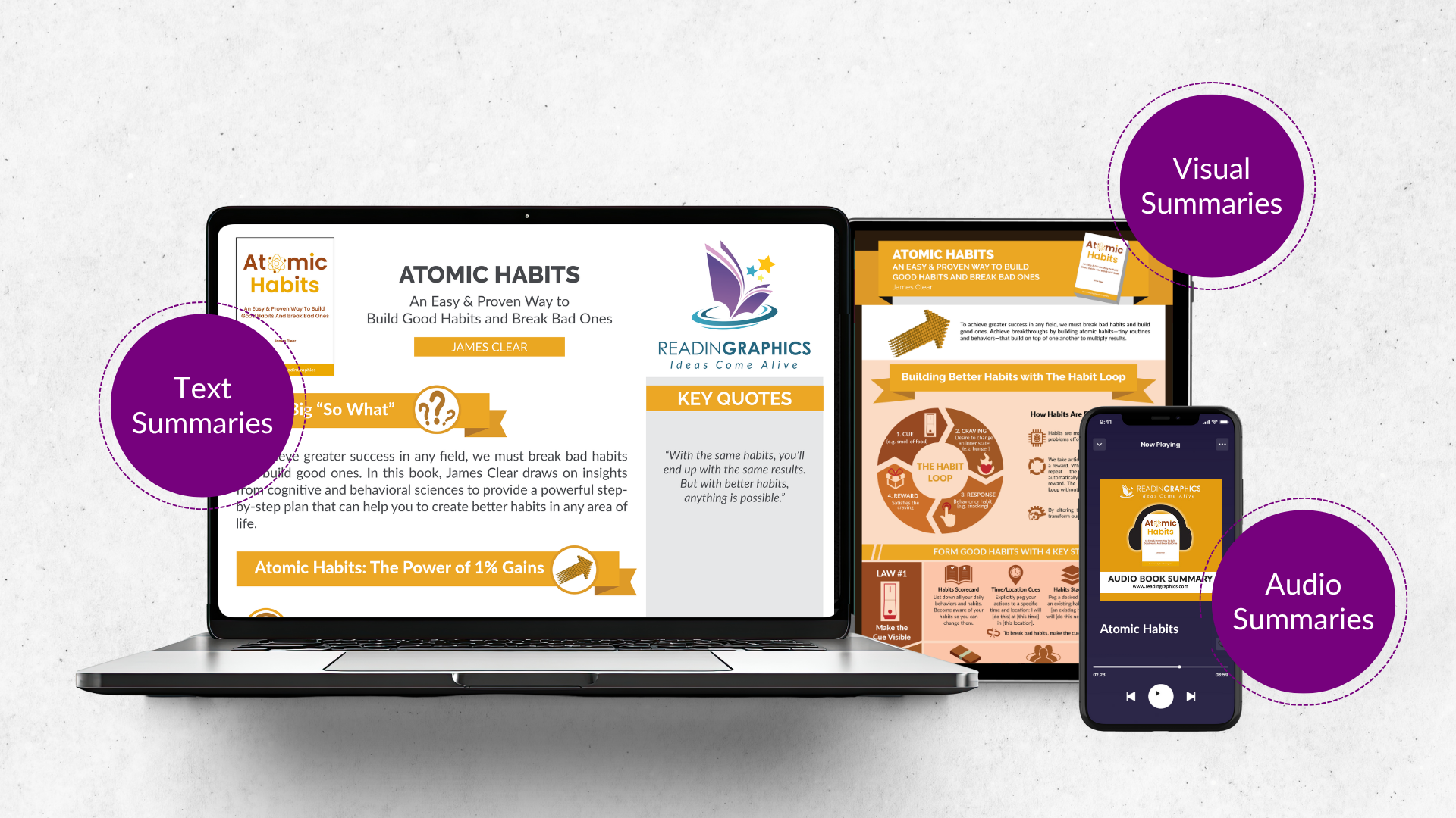
In this article, we’ve briefly outlined some of the key insights and strategies you can use to achieve desired change. For more examples, details, and actionable tips to apply these strategies, do get our complete book summary bundle which includes an infographic, 16-page text summary, and a 26-minute audio summary.
This is a short, easy-to-read book with many useful illustrations, diagrams and examples on the key concepts of usability, tips and insights outlined in this summary. You can purchase the book here for the full details, or check out more resources (including scripts, videos and checklists for usability testing at sensible.com.
Don’t Make Me Think, Revisited book rates 4.6 stars on Amazon (4,586 reviews).

Who Should Read This:
- Web developers and designers
- Entrepreneurs & business leaders involved in marketing and business development
- Anyone interested to understand human behavior & how to make things more usable
Don’t Make Me Think, Revisited Chapters
Our summaries are reworded and reorganized for clarity and conciseness. Here’s the full chapter listing from Don’t Make Me Think by Steve Krug, to give an overview of the original content structure in the book.
See All Chapters (Click to expand)
INTRODUCTION: Read me first
Throat clearing and disclaimers
GUIDING PRINCIPLES
CHAPTER 1 Don’t make me think!
Krug’s First Law of Usability
CHAPTER 2 How we really use the Web
Scanning, satisficing, and muddling through
CHAPTER 3 Billboard Design 101
Designing for scanning, not reading
CHAPTER 4 Animal, Vegetable, or Mineral?
Why users like mindless choices
CHAPTER 5 Omit words
The art of not writing for the Web
THINGS YOU NEED TO GET RIGHT
CHAPTER 6 Street signs and Breadcrumbs
Designing navigation
CHAPTER 7 The Big Bang Theory of Web Design
The importance of getting people off on the right foot
MAKING SURE YOU GOT THEM RIGHT
CHAPTER 8 “The Farmer and the Cowman Should Be Friends”
Why most arguments about usability are a waste of time, and how to avoid them
CHAPTER 9 Usability testing on 10 cents a day
Keeping testing simple—so you do enough of it
LARGER CONCERNS AND OUTSIDE INFLUENCES
CHAPTER 10 Mobile: It’s not just a city in Alabama anymore
Welcome to the 21st Century. You may experience a slight sense of vertigo
CHAPTER 11 Usability as common courtesy
Why your Web site should be a mensch
CHAPTER 12 Accessibility and you
Just when you think you’re done, a cat floats by with buttered toast strapped to its back
CHAPTER 13 Guide for the perplexed
Making usability happen where you live
Don’t Make Me Think: A Common Sense Approach To Web Usability [Publication year:December 24, 2013/Edition: 3rd/ ISBN:978-0321965516]
About the Author of Don’t Make Me Think, Revisited
Don’t Make Me Think: A Common Sense Approach To Web Usability is written by Steve Krug–a user experience professional and consultant based in the United States. He is the founder of consulting firm based in Chestnut Hill called Advanced Common Sense and which offers usability workshops.
Don’t Make Me Think, Revisited Quotes
“You can find more problems in half a day than you can fix in a month.”
“Focus ruthlessly on fixing the most serious problems first.”
“Usability is about people and how they understand and use things, not about technology …while technology often changes quickly, people change very slowly.”
“Usability is, at its heart, a user advocate job…Usability is about serving people better by building better products.”
“Testing reminds you that not everyone thinks the way you do, knows what you know, and uses the Web the way you do.”
Frequently Asked Questions
Is Don’t Make Me Think still relevant?
Yes, the book remains relevant because its core principles—simplicity, clarity, and intuitive design—are still fundamental to UX. Human interaction with interfaces hasn’t changed, so Krug’s guidance still applies.
Who should read “Don’t Make Me Think”?
This book is ideal for designers, developers, product managers, and anyone creating digital experiences. It’s especially helpful for beginners seeking a clear, practical introduction to usability.
Is “Don’t Make Me Think” worth reading?
Yes, Don’t Make Me Think is worth reading, offering simple, actionable UX principles to improve any website or app. It’s short, engaging, and provides valuable insights even for seasoned professionals.
What does Don’t Make Me think actually mean in UX design?
It means users should navigate and understand a website without thinking. Interactions should be so intuitive that tasks can be completed effortlessly.
What are the core usability principles explained in the book?
The book emphasizes clarity, simplicity, and reducing cognitive load so users focus on goals. Krug also promotes intuitive navigation, visual hierarchy, and avoiding unnecessary complexity.
How does the “Revisited” edition differ from the original?
The updated Don’t Make Me Think adds new examples, modern design insights, and expanded mobile usability content, refreshing Krug’s core principles for today’s web and mobile environments.
What is the recommended approach to usability testing according to Krug?
Krug advocates for simple, low-cost usability testing with a small number of users on a regular basis. He emphasizes that frequent, imperfect testing is far more valuable than waiting for a perfect test.
Click here to download the Don’t Make Me Think summary & infographic