Have you tried using visual learning strategies to better learn or share ideas with others, only to find that it’s not as effective as you thought?
Maybe you saved an infographic, a mind map, or a video about a book you loved, thinking you’ll return to it later to revisit the concept. But 2 weeks later, when someone mentioned the book, you can’t remember what it was about or even where you saved it.
The problem doesn’t lie with you OR the visual materials. It’s about how you’re using it. Visual learning tools do work, but looking at something and actually learning from it are two different things, and most people never find out what goes in between.
This guide shows you how to use visuals effectively by choosing the right visual format for your purpose, engaging with a visual summary, following the right process to ensure ideas stick, and knowing when to start using visuals based on your situation.
We’ll also cover what to do when visual materials don’t exist for the books you’re reading yet. While we’re focusing primarily on adult learning in general, the same principles apply if you’re looking for tips on better study habits. In essence, this article covers:
- How do visuals help you learn better?
- How to choose the right Visual Format for your learning goal?
- Visual Learning Strategies: How to Actually Retain What You See
- How to create effective visual summaries?
- Where to Start (Based on Your Situation)
- Conclusion: Ready to Master Visual Learning?
- Frequently Asked Questions
Let’s go through each one together.
How do Visuals help you Learn Better?
Do visual learning tools really work? And if so, how do they work? 
Some claim that visual-spatial learners work best with visuals. But the truth is, all of us think better in pictures and patterns than words. In an earlier article, we explained the science of why and how visual thinking works. One problem is the absence of relationships between ideas.
Information sticks when you can see how things connect. Instead of remembering isolated sentences, you remember how ideas relate. Instead of recalling random points, you recall a framework. And frameworks are what make ideas usable, whether you’re explaining something in a meeting or applying it to a real problem.
Visuals make those relationships obvious. When you visually structure information, you automatically group similar ideas. Spatially connecting them gives your brain clear reference points, which makes the whole structure easier to hold and recall.
Visual tools (like mind maps, diagrams, or infographics) are the natural way to externalize this. But not all visual tools work the same way. A mind map shapes how the brain links ideas differently to a video or an infographic. So when you’re using visual thinking to learn and retain, choosing the right format matters as much as using one at all.
Do Visual Learning Strategies only help Visual Learners?
Not at all. Everyone benefits from visuals, even if you don’t think you have a visual learning style. Visual content can make any idea clearer and easier to remember, whether you’re a visual learner or not. Visual aids and other forms of visual stimuli help your brain organize information, spot connections, and create mental hooks. Adding visuals to your notes or summaries gives extra cues that make recall and understanding faster and more reliable.
Does the Visual Format you Choose Affect how well you Learn?
When the visual format matches what you’re trying to understand, your brain processes and stores the information more easily. The format you choose determines the learning outcome you get. Some formats favor passive understanding, others favor building structure, and others support recall and review.
Think about watching a video to learn the Blue Ocean Strategy for navigating crowded business competition. It feels clear in the moment, but nothing sticks afterwards. A video is a passive format of learning that usually only requires consuming, without taking down notes or solving problems on your own.
Blue Ocean Strategy needs active engagement. You have to work with the relationships between concepts, not just follow an explanation as it unfolds. A concept map forces those connections. An infographic lets you see the full picture and zoom into details without losing context. The format has to match what the ideas actually require.
How to choose the right Visual Format for your Learning Goal?
Here are examples of visual learning formats, how they support learning, and when to reach for each one.
Visual Maps
Visual maps, often called mind maps, organize ideas as branches from a central topic, mirroring how your brain naturally connects information.
Why this visual format works:
Building your own mind map helps you remember ideas. Every decision you make about what connects and where things go creates a memory trace. Tony Buzin, author of Mind Map Mastery, stands by them for exactly this reason: placing ideas as connected branches means each point naturally reminds you of related ones.
The Catch:
That effect drops sharply when you view someone else’s map, instead of making your own mind map. Their keywords and spatial logic only make sense with context you don’t have.
Video Summaries
Video summaries present a book’s key ideas in a narrated, often animated format, giving you the core concepts without sitting down with the full text. They’re one of the most accessible ways to get a quick overview of an unfamiliar topic
Why this visual format works:
They’re great for quick overviews, procedural learning, and deciding whether a topic is worth your time. Easy to consume on the go, especially when the content involves movement or technique. Search for any popular book, and you’ll find options immediately.
The Catch:
The transient information effect works against you. While you’re processing one point, the next is already playing. You can’t skim, jump to a specific section, or see the whole picture at once.
Sketchnotes
Sketchnotes combine handwritten notes with drawings, icons, and simple diagrams. They are a way of capturing ideas visually as you read or listen in real time.
Why this visual format works:
In 2016, research from the University of Waterloo found that drawing content produces 2× better recall than writing it. Rough sketches work just as well as polished ones. Combining visual and verbal processing in real time creates stronger memory traces than writing alone.
The Catch:
Your visual shorthand like your icons, or spatial logic, doesn’t transfer to anyone else. They’re looking at your personal code without the context that makes it meaningful.
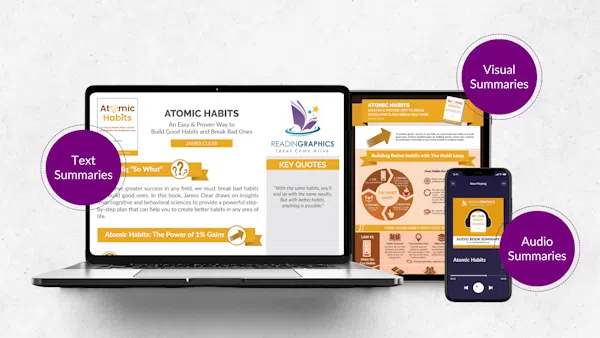
Infographics
Infographics combine images with supporting text in a structured, persistent layout. With infographics, everything stays visible at once, so you can see the full picture and zoom into details without losing context. A well-designed infographic is one of the most versatile learning tools available.
Why this visual format works:
Infographics often use complete phrases, while mind maps typically use single keywords. That difference changes how deeply you think about the idea. When you’re learning from someone else’s work, complete phrases help you fully grasp their intent. Persistent visibility also supports spatial memory. Your brain doesn’t just remember the idea; it remembers where it sat. You might recall that one point was at the top, another was grouped on the left, and a related idea sat right next to it. This format works whether you’re learning from someone else’s work or building your own, and it holds up across every stage, from first exposure, to active recall, and review.
The Catch:
Quality varies dramatically. Many so-called infographics are just text with decorative graphics. Look for complete sentences, clear visual hierarchy, and spatial organisation that actually shows how concepts relate.
Here’s a quick comparison to help you decide:
Visual Format Comparison
| Format | What It Is | Key Benefit | Key Limitation | Best Used For |
| Mind Maps | Branching diagrams that organize ideas from a central topic | Forces you to decide what connects; strong generation effect | Keywords require interpretation; benefit drops when viewing others’ maps | Creating |
| Video Summaries | Narrated, often animated presentation of a book’s key ideas | Engaging and accessible; good for procedural learning | Transient information effect; can’t skim or reference easily | Using (limited contexts) |
| Sketchnotes | Handwritten notes combined with drawings and icons, captured in real time | Drawing effect = 2× recall; personal processing strengthens memory | Visual shorthand is personal; doesn’t transfer to viewers | Creating |
| Infographics | Structured visual layout combining images and complete-phrase text | Deep semantic processing; persistent visibility; works for creators and viewers | Quality varies widely; many are just decorated text | Both (especially Using) |
Visual Learning Strategies: How to Actually Retain What You See
The difference between a visual summary that teaches you something and one you just skim comes down to five words: Overview, then Action, then Review (OAR method). An overview helps you see the big picture, action turns ideas into steps you can use, and review makes sure the ideas last over time.
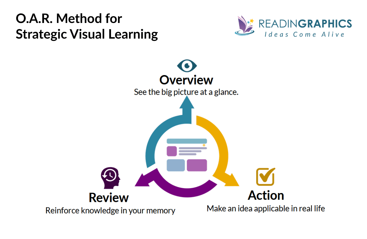
Here’s how the method works.
Step 1: Overview (~1 Minute)
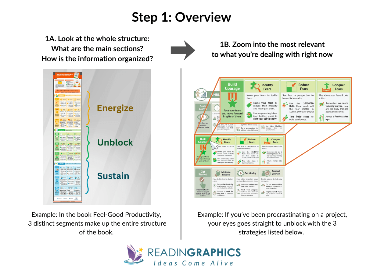
Before you focus on any detail, look at the whole structure. What are the main sections? How is the content organized? What’s the central framework everything is built around?
You’re answering one question: what is this really about, and which part matters most to me right now? Once you’ve seen the whole picture, narrow it down to one section that connects to something you’re working on this week.
- Look before you read. In a well-designed infographic, the core framework is usually the most visually dominant element. Let the structure tell you what matters before the text does.
- Ask one targeting question. After your scan, ask: “What’s the one section here that connects to something I’m actually dealing with this week?”
Step 2: Action (A Few Minutes)
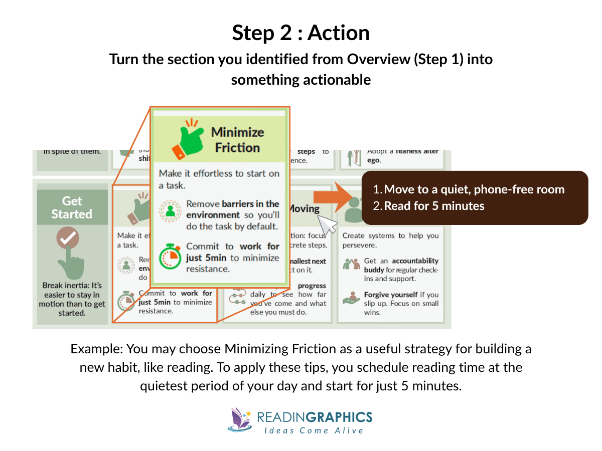
Pick the section you identified and connect it to a specific situation in your life right now.
Most people skip this step. They look at the content, think “that’s interesting,” and move on. When you map a framework onto something real, such as your situation, your goals, or your problem, your brain stores it as something connected, not just something seen. That’s what makes it retrievable later.
The action doesn’t have to be big. It just has to be specific.
- Go in with a problem, not just curiosity. Before sitting down with a visual summary, spend 30 seconds naming your current challenge. Notice how this helps you shift from “what does this mean?” to “how does this apply to Tuesday?”
- Commit to the smallest possible action. Make it specific enough to put in a calendar: not “try the technique” but “Thursday morning, before email, I’ll do X.”
Step 3: Review (A Few Minutes, Spaced)
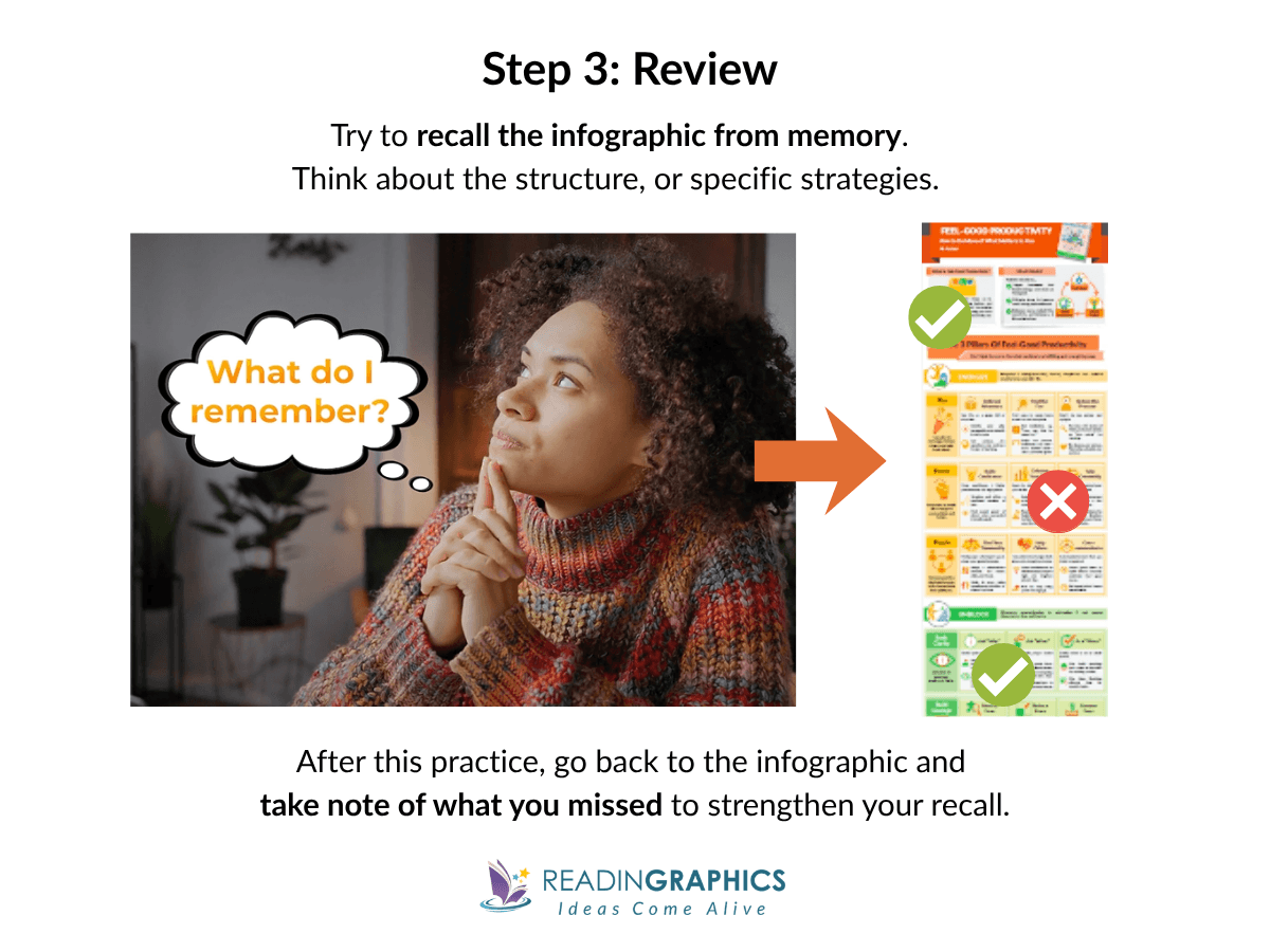
After you’ve taken action, come back to the visual summary and test your recall from memory. You don’t need to remember everything, just what you can: the overall structure, the main strategies, and the section you focused on.
Recalling first, then re-exposing yourself to the full summary, is what moves ideas into durable memory. That loop is spaced learning, one of the most effective ways to build long-term retention.
- Don’t wait too long for your first review. The best window is 24 – 48 hours after your Action step. Two days gives you enough time for retrieval to feel slightly effortful, which is exactly when it builds memory most effectively.
- Use the visual to catch what you missed, not to re-read from scratch. You’re reinforcing gaps, by focusing only on what you couldn’t retrieve.
- Come back to a different section next time. Once your first section has served its purpose, return to the Overview and pick a new one. Your understanding deepens with each cycle.
Here’s what makes this method powerful: OAR is a loop, not a checklist. Overview, Action, Review, then repeat. Each cycle, you go deeper into the material or pick a new section to apply. Over time, the ideas stop living in a saved file and start living in your head, ready when you actually need them.
Ready to see the O-A-R method in action? Get a free visual summary from ReadinGraphics and try it yourself.
How to Create Effective Visual Summaries When None are Available?
Despite countless digital tools and online resources being added to the Internet every day, you might struggle to find the exact visual summary you need.
You can build your own visual summary in under 30 minutes without any drawing skills. Start by pulling out the main ideas, arranging them to show how they connect, and adding examples to make things concrete. Once you have those three things, the steps below follow naturally.
Why Create Your Own Visual Overviews?
People who sketch concepts recall twice as much as those who write notes, and the quality of the drawing does not affect the benefit.
Plus, if you prefer a visual learning style and absorb information better by seeing it, turning notes into a visual representation will help you learn and teach more effectively.
4 Step-Action to Create your own Visual Summaries.
Here’s a quick 4-step action to creating your own visuals in just 20-30 minutes. Think of it like visual note-taking.
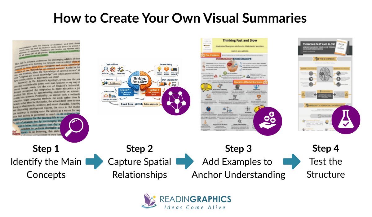
Step 1: Identify the 3-7 Main Concepts
As you read (or after you finish), ask: What are the core building blocks? Not every detail—just the main framework. Most non-fiction books organize around 3-7 key ideas.
Write these down as short phrases (not single keywords). For example, not “Routine” but “Cue triggers automatic routine.”
Step 2: Sketch Spatial Relationships
On a blank page, start placing concepts spatially:
- Central framework in the middle
- Supporting concepts around it
- Use boxes for ideas, arrows for relationships
- Group related ideas close together
You can also add simple visual aids to make the structure easier to remember:
- Use color coding to group related ideas
- Add small icons or symbols as visual cues
- Vary size or spacing to show importance
These don’t need to look good. They simply create visual cues that help your brain recognize patterns and recall the structure later.
Step 3: Add Examples to Anchor Understanding
Under each main concept, add 1-2 specific examples or tactics. These anchor the abstract with the concrete. Example: Under “Keystone Habits,” write “Exercise → better eating → better sleep.”
Step 4: Test the Structure
Look at your rough visual from arm’s length. Ask:
- Does this structure hold together?
- Is the real core in the center, or did I bury it?
- Are any “separate” ideas actually the same thing?
- What’s missing?
If something feels off, don’t worry. Move the boxes around, merge overlapping ideas, and redraw. Each time you do this, your understanding gets clearer.
Don’t worry about making your summary picture perfect. What’s important is that the structure is visible in a way that paragraphs or bullet points can’t. When notes are just linear, important connections are hidden, ideas that belong together get scattered, and the main point can get lost.
A rough visual shows you everything at once. You can see how the pieces fit, spot gaps, and fix them, without stressing about how it looks.
[Note: Many of these ideas (e.g. color coding, connecting ideas) are also applicable when creating visual tools like graphic organizers (though we don’t dive into those).]Where to Start (Based on Your Situation)
Now that you have the tools, how you use them depends on what you’re trying to do. Here are three common situations and the best way to approach visual learning in each one.
When You’re Short on Time
You want to learn but can’t commit hours to it right now. Maybe you have a meeting in 20 minutes, or you’re between tasks and have a narrow window
What to do:
- Start with the Overview step only: Scan the visual for the core framework. You won’t absorb everything, but you’ll know exactly where to come back when you need it.
- Ask yourself which section connects to something you’re currently dealing with, and save the rest for later
Sign of Progress:
You can identify the core framework of an unfamiliar visual summary in under 30 seconds, and know immediately whether it’s relevant to what you’re working on.
When You’re Teaching or Coaching
You need to explain a concept, run a workshop, or walk a client through a framework, and vague recollections from a book you read months ago won’t cut it.
What to do:
- Run the Overview step: Scan the visual tool (video or graphic, etc.) and get the big picture first
- Then narrow the Action step to the section most relevant to the people you’re teaching, coaching or mentoring.
Sign of Progress:
You can answer follow-up questions from your team or clients without going back to check your notes because you’ve already connected the ideas to real situations, not just read them.
When You’re Doing Deep Study
You’re not skimming. You want to understand something well enough to apply it with nuance, connect it to other frameworks, or build a reference you keep coming back to.
What to do:
- Run the full OAR cycle on one section.
- Go back and repeat with a new section. Over multiple passes, you’ll start seeing connections across ideas that weren’t obvious the first time.
Sign of Progress:
You start noticing connections between frameworks across different books without having to prompt yourself. You’ve done the work to anchor each one to something real, hence the ideas link on their own.
Conclusion: Ready to Master Visual Learning?
Most people treat visual learning as a passive activity. The ideas feel clear in the moment, but a week later, they’re gone.
What this guide has covered is the gap between seeing and learning. Visuals work because they force relationships between ideas, but the format you choose shapes what kind of learning actually happens. A mind map you build yourself creates different memory traces than a video you watch once. An infographic with complete phrases gives you something to retrieve weeks later.
OAR closes the loop. Overview gives you the big picture and a place to focus. Action connects the idea to something real in your life. Review builds the kind of memory that holds up under pressure, not just right after you read it. Run the cycle once, and you’ll feel the difference. Run it across multiple sessions and the ideas start linking on their own.
And when no visual exists, you don’t need to wait. A rough sketch of the main concepts, drawn in 20 minutes, will do more for your retention than three re-reads of the original text.
Pick one book that matters to you right now. Choose your format. Run it through OAR. The ideas that used to disappear will start showing up, in meetings, in conversations, in decisions, because you’ll have actually learned them.
If you want to start with a ready-made summary, grab a free visual summary from ReadinGraphics and put the method to work. Subscribe to access hundreds of best-selling book summaries and start putting what you read to work.